Showing posts with label marketing. Show all posts

October 12, 2012

:: brilliant music, brilliant art ::

josh garrels, easily one of my favorite singer-songwriters and performers (ever), recently unveiled the pieces of the dvd box set for his documentary The Sea In Between, filmed on mayne island, BC.  i cannot wait to get my hands on this.  check out the view finder dvd art...brilliant! 


images, box set art & packaging by stereotonic
click images to link directly to box set photo album

September 11, 2012

:: digging the longing ::

i looove this artwork.  the colors, the type, style, copy, images, content...all of it. 


also a big fan of the concept.  many months ago i got a free-with-email-address download from all sons and daughters via noisetrade (unfortunately, the prone to wander ep is no longer available!) and received an email from them today, offering up a link to preview and pre-order their upcoming album.  i don't want to get too soap-boxy here, but if you're not going to give-give your music away, this is a smart way to semi-give it away and entice people to buy. 


May 16, 2012

:: new media marketing thoughts ::

i don't really like to complain without having some sort of helpful feedback or solution for the issue i'm complaining about.  a few minutes ago, i was about to gripe about something on facebook and it occurred to me i could, instead, post some suggestions that might actually help some of the culprits who were inspiring the gripe.  

figured i'd post the update here, too, in case someone comes across this who's not a friend on fb.  feel free to leave a comment with feedback, questions, or..well...even complaints! 
some thoughts on new media marketing: not a fan of shortened links from twitter on my newsfeed. especially from a business and when linking to images/videos. you lose the visual of the image/video that you get when you post directly to facebook (plus, the shortened urls look spammy).

if you're a business that links twitter to facebook, be more selective with which tweets automatically update to fb. push copy-only tweets to fb but manually enter any posts containing images/videos/links. there is an app called "selective tweets" than can make this easier for you.

and never ever tweet something and then post it as a status (too) if you have your twitter/fb accounts linked. redundant back-to-back posts are a quick way to be hidden.

August 30, 2011

:: girl crush ::


cintia dicker for aerie


January 16, 2011

:: vehicle for style ::

anthropologie.com
[click image to enlarge]


that chair! that luggage! that quilt!

December 20, 2010

:: serious inspiration ::

we (corey smith) were in a meeting today, discussing art concepts for an upcoming album and supporting photo shoot & marketing materials. the following vogue spread was brought up in response to potential art direction. strictly as inspiration in terms of coloring and lighting. whether or not we go this route, i am so glad this spread was brought to my attention because - WOW. amazing. makes me want to do a finger-wave up-do, put on a pretty little dress & some red lipstick and hit the town for some rhythm & romance! (i just thought, "that'd be a great title for my (non-existent) country album." googled it, and...too late.)

annie leibovitz for vogue

November 03, 2010

:: new from anthro ::

got my anthropologie catalog today. no surprise it's filled with beautiful clothes and styling. along with some quirkiness, whimsy and dreaminess. some of my favorite outfits, items and images:

anthropologie.com

November 02, 2010

:: op for mango ::

olivia palermo and boyfriend johannes huebl for mango

i might love her look, but i do not love the look of her as a model. she looks so awkward & uncomfortable in each of these pictures. at least the last photo is more candid - she appears caught off guard - so her posed stiffness seems a little less intentional.

i do really like the dress in the first picture (on her), though.

October 12, 2010

:: gap update ::

an update to the gap logo saga i mentioned earlier this week.

October 08, 2010

:: malling. mauling ::

gap launched its new logo earlier this week and so far, the response is less than stellar. from the looks of things across the web - from design blogs to the gap facebook page - the reviews won't be getting any better. there are even rumors that this is all just a marketing stunt, drawing more traffic to the gap's website and facebook page. (i did notice that while they've change the logo on the website, the favicon is still sporting the old logo.) people really just hate this new look.

so much so that the folks at gap have not only heard the cries but are dropping hints that they might do something about it:
"Now, given the passionate outpouring from customers that followed, we've decided to engage in the dialogue, take their feedback on board and work together as we move ahead and evolve to the next phase of Gap."
gap president, marka hansen, at the huffington post

i'm interested in seeing what transpires (if anything). i love the idea of a customer created logo for a brand as old and established as gap.


and in similar fashion (get it - "fashion"? har), belk has also announced a re-branding, turning their 43 year old logo into a much more modern, youthful wordmark. i like the fresh, new look, but have to admit that i'll sort of miss the old traditional logo that's been around as long as i have (+11)!


more information available at underconsideration.com/brandnew.
just click on an image for the direct link.

July 07, 2010

:: girl scouts get bangs ::

i'm considering getting some bangs. i do this every week when i get bored with my current 'do. i need to just make the leap, but i dread the growing out process (assuming i end up wanting to grow them out - i always do). but why not go for it? the girls scouts have.

underconsideration.com/brandnew

a logo revitalization and modernization for the girls scouts logo brings about a new hairstyle, a nose job and a little lip-lift. read more about the changes here.

June 16, 2010

:: fashion police make arrest ::

can a single color be considered a brand?
what if that single color is used on a single article of clothing? say, an orange dress - with absolutely no typical brand markings like a logo, slogan, name or color combination.

according to the international federation of association football (FIFA), the answer is yes. 36 girls showed up at a match wearing orange mini-dresses and were kicked out based on the claim that their attire was a case of ambush marketing. (two of the women have been arrested for their involvement in the illegal campaign.)
had i seen this group of women in their not-so-flattering dresses, i might have thought "beer" or "liquor," as they do closely resemble beer/liquor girls here who wear inexpensive, revealing clothing to promote alcohol at various clubs/events. but it would have been highly unlikely that i would link the group to a particular sort of beer (bavaria) without them having been detained, ejected (and/or) arrested and the media having picked up the story.

goal.com
stylelist
ny times blog - the lede
reuters

all in all, i gotta give the company an A for effort - or really just for the luck involved in having its attractive minions getting busted and actually making this news. but an F for ethics for attempting something like this (a 2nd time).

April 23, 2010

:: chubby birdy ::

i love learning something new. i especially love teaching myself something new through research, trial & error. today, i taught/learned how to add a favicon (i also learned the word "favicon") to my blog. so i designed a couple of different ones and chose the one that stood out the most on the tab/toolbar, but it's still hard to really tell what it is. since -you- probably have no clue what you're looking at, i figured i'd post the larger image here. while i love this chubby little birdy, i would like something that's more legible, so we'll call him a work in progress.

October 14, 2009

:: lifting up a dreamer ::


5 years ago this week i was in california, on tour with REM. it was a dream (that i've never even thought to dream) come true. it was the perfect introduction to california - los angeles, santa barbara, berkeley and irvine. the weather was amazing in each city. (a little cold for my liking near the bay, but it complemented the overall experience.) the company was entertaining (in so many ways) and our talented southern hosts were hospitable and incredible.

there is a certain kind of night that takes me back to the rock-lined bowl in the hills of santa barbara. the night that it all hit me. the night that i took in my fortune, the music, the lights and the weight of it all like never before. we were on the eve of an election. the message was clear. the response was mixed. the inspiration heavy and i carried it with me. 5 years later, on certain special nights, i still carry it with me.


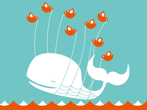
i'm loving the following pieces by alvin diec. cheerful, but not frilly. clean. uncluttered. quirky. there's a "retro" vibe about them. well, except for the fact that they echo the oh-so-current fail whale.

alvindiec.com


"lifting up a dreamer" (the fail whale) by yiying lu
yiyinglu.com

August 18, 2009

:: imitative marketing ::

i was at walmart the other night and noticed that the great value ice cream cartons stood out from the black breyerses and the yellow mayfields more than usual. as i moved along and noticed that the great value magic eraser boxes looked a little more generic than mr clean's (yes, it is generic, but it LOOKED generic) and the granola bar boxes were more noticeable than i remembered them being.

and then it hit me - walmart is copying publix
and i like it.

while i don't think walmart's new packaging is as attractive as publix brand's (it looks like an incomplete thought), the general design concept is there - plain white background with a color image of the product, usually off center to the brand's name. i could go on with my assessment of the new look, but this blog i found when searching for images really sums it up, so why be redundant? though normally a lover of sans serif - of the less vs the more - in this case i agree that in the logo branding alone a little more sh/c ould have been done.


and while i'm at it - also from under consideration's 'brand new' - i love the use of windows in this packaging. very cute & clever.


August 06, 2009

:: simply attractive ::

i love the design of publix brand products. crisp & clean. there's something so retro in the simplicity.

a stark image on a white background with a bold strip of color to set apart different things in a particular category. that's it. purely eye-catching.


imagine if all brands used publix's design technique - if the entire store was filled with items like these - it'd be such a visually relaxing and peaceful place. (and yes, perhaps boring & totally impractical. but sometimes i welcome boredom in this day of "signs, signs, everywhere are signs.")