August 31, 2009

:: whether the weather ::

last night i was watching pursuit of happyness and noticed, in the section called "running" that i was very uncomfortable. i couldn't get past the fact that it was 80something degrees outside (here) and will smith was running around the city (not this city, on that day, mind you) in a full pantsuit and wasn't sweating. for all i know it was 50 degrees while he was running about and he was quite comfortable.

today - on this chilly and overcast day (yes, we've had a major temperature switch!) - i look at the following ella blue picture and i think how cold these little girls must be in their flowing sundresses and how icy that water must feel (despite the fact that the temperature was in the mid-high 70s in washington, where/when this picture was taken). i bet if i'd seen this yesterday, on such a hot august day, i'd be envious of that cool breeze blowing in from the water, wishing i could be on one of those boats.


[unfortunately, the ella blue studio is down and the photo is no longer available.]

August 26, 2009

:: une fille comme moi ::

yay to finding another new potentally favorite blog! thanks to the Sartorialist for pointing me in the direction of Garance Dore where i was greeted by this picture, which illustrates what i want to look like and feel like and how i want to appear every day. (not in a literal translation - i'm not a big fan of shorts and my thighs are entirely too wide (relative to the rest of me) to wear rolled denim shorty shorts and i think that summer scarves are, while a lovely looking accessory, utterly absurd.)


but the feeling, here. the feeling, the style, the look. that's what i want. always a lover of white t-shirts, i like the rolled sleeves echoing the rolled cuffs. and the long wavy hair and the crossbody bag. i positively adore denim, white, brown and gray together! i would turn the shorts into jeans, change the scarf into some other gray something, and add navy blue (a wrap perhaps, because i always need a hoody or sweater). easy enough, right? but i wouldn't feel like i looked like this. and that's what i want.

August 24, 2009

:: graffiti the world ::

"graffiti the land with skyscrapers. graffiti the sky with airplanes and satellites. graffiti the minds of children with your man-made laws. graffiti the world, I saw the writing on the wall." [from graffiti the world by rehab]

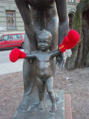
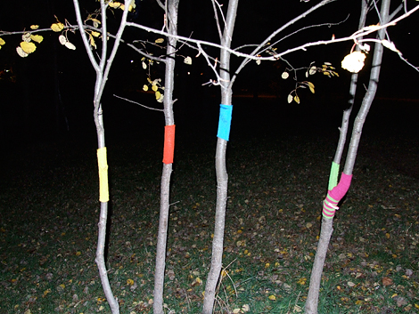
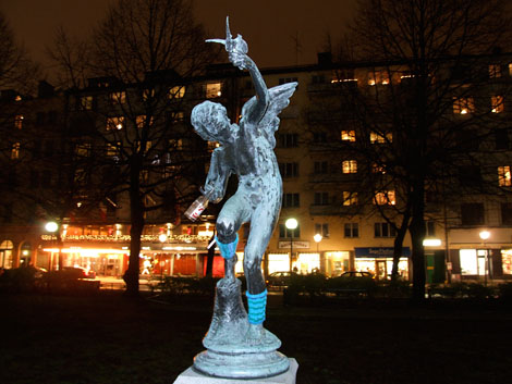
i almost want to re-learn how to knit so that i can take part in the clever revolution (cleverlution?) known as YARNBOMBING. hilarious. creative. beautiful (perhaps more in concept & purpose than execution). tacky. awesome.


maskerade.blogsome.com

:: when turtles fly ::

i want one of these

which makes me think of these

click images to purchase or see videos

August 22, 2009

:: thinking (of) pink ::

one of my favorite bloggers has been diagnosed with lyme disease and has had to cut waaay back on her fantastic design & craft projects. it's been a long time since pink has consistently posted on her blogs but with this news, it seems the posts will be even more infrequent and that just makes me sad.

her stories are hilarious. her writing is funny & succinct. her eye for cute vintage goodies is great. and her love for all things pink is incomparable!

casapinka and pink mohair were 2 of the first sites i started regularly checking and they're still on my "must check" list each time i go blog reading.

some pink highlights
stories:
prepared.
houston, we have a tampon, er, problem.
diaper down.
placido crush.

projects/pictures:


casapinka.typepad.com

August 18, 2009

:: imitative marketing ::

i was at walmart the other night and noticed that the great value ice cream cartons stood out from the black breyerses and the yellow mayfields more than usual. as i moved along and noticed that the great value magic eraser boxes looked a little more generic than mr clean's (yes, it is generic, but it LOOKED generic) and the granola bar boxes were more noticeable than i remembered them being.

and then it hit me - walmart is copying publix
and i like it.

while i don't think walmart's new packaging is as attractive as publix brand's (it looks like an incomplete thought), the general design concept is there - plain white background with a color image of the product, usually off center to the brand's name. i could go on with my assessment of the new look, but this blog i found when searching for images really sums it up, so why be redundant? though normally a lover of sans serif - of the less vs the more - in this case i agree that in the logo branding alone a little more sh/c ould have been done.


and while i'm at it - also from under consideration's 'brand new' - i love the use of windows in this packaging. very cute & clever.


August 10, 2009

:: which wood i do ::

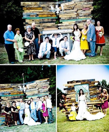
inspiration for my guest bedroom wall.


i had initially envisioned gray white washed beams, but after seeing these photos from the talented Kyle Hale, i'm thinking re-purposed shipping pallets and an old painted window.

kylehale.net & kcandsara.blogspot.com
check out more of the wedding pics from KC and Sara's blog. what a terrifically creative idea to frame an outdoor wedding and make it feel more intimate than wide open.

love.

August 06, 2009

:: handsome smile wearing handsome shoes ::


there will remain a part of you.

:: simply attractive ::

i love the design of publix brand products. crisp & clean. there's something so retro in the simplicity.

a stark image on a white background with a bold strip of color to set apart different things in a particular category. that's it. purely eye-catching.


imagine if all brands used publix's design technique - if the entire store was filled with items like these - it'd be such a visually relaxing and peaceful place. (and yes, perhaps boring & totally impractical. but sometimes i welcome boredom in this day of "signs, signs, everywhere are signs.")

:: this guy ::

this guy has very round nostrils.

August 05, 2009

:: the making of a gentleman ::

only God can make a gentleman (according to King James), but style like this certainly lends to that creation!

thesartorialist.blogspot.com

if i were an older man, i believe this is how i would like to dress. and sit.


August 04, 2009

:: the color of truth ::

"the color of truth is gray." - andre gide

i remember when i fell in love with gray. it was 1995 and i was in the greenville mall parking lot, just outside montgomery ward. i wore a silvery gray top with my favorite jeans and brown not-quite-combat boots.

years (and two silver cars) later i painted my bedroom the most perfect shade of gray and decided that nothing - and i meant nothing - would be displayed in the room unless it was a shade of gray (silver included), green or brown. i even kept my alarm clock hidden until i was able to find a silver one with green digital numbers (but, admittedly, a black screen). obsessive? perhaps. inconvenient? most definitely. that room's decor was never completed, and i've yet to let go of the idea that i can decorate my bedroom with such strict color limitations. (currently, i'm aiming for chocolate brown, gray and white. only.)

in painting my first home i have found a new perfect gray (olympic "quill"). i still drive a silver car. and now i have a pretty big crush on yellow & gray. the serene with the perky. the masculine with the feminine. the light (or a dark, rich charcoal will do) with the bright.

ohmydeerhandmades.blogspot.com :: tecpetaja.blogspot.com

much, much more to come on these two amazingly talented people, i'm sure. i came across Oh My Deer today and was immediately hooked! like a good book, i don't want to reach the end (or beginning) of the blog. it's just that good.